Showing posts with label Posters. Show all posts

Wednesday, 3 December 2014

Poster Update

After printing off a tester for the poster it came out that the text on the back was upside down compared to the image on the other side. Also the fact that A4 paper seemed way too big size wise, specially if we were going for leaflet like posters to be placed in the SU. 
We settled for A5 as it's a suitable size to work with as it would save paper by having 2 posters on one sheet.


I printed these at home however the paper I used not of good quality, so I waited to do it in the library. Yet due to personal reasons I wasn't able to print out the posters till Monday 8th. Which sadly didn't go as planned either. 

Once I got into the library I had a few problems with printing it through a laptop, so after that kerfuffle I moved to a PC and tried again. YAY, it finally worked, but this it was the posters themselves that were the issue.   

On the back where the basic information is put had some errors on it due to the fact I print screened from the original .pages file. So after ridding the posters of errors I could finally print these off, and get them around uni.


But because the hassle with the posters took longer then I hoped we barely managed to get the posters into the SU in time for lunch. In which case we stuck some on notice boards throughout the uni and used the ones we had left on the student village. We weren't able to cover much as the cost of the printing was quite high for a small amount, however we managed to print off 40 posters in total.
Surprisingly this hasn't put me off making posters in the future, it just means I know what to look out for and what not to do again. Also PDF's are a bitch.


Sunday, 30 November 2014

Final Poster

For the final poster I used the map and urban part of my research to inspire this final piece. I searched for a urban colour palette just to see what it gave me, and to my surprise I found a nice selection of colours that stand out but aren't an eye sore.


I then had to think about what I was actually gonna put on the poster, and looking back at the research I had done I decided to try something new with a map of Farnham.

Taking this screenshot of Farnham I rotated it 180 degrees so it fit into the portrait format. Then, with a lot of patience, I used the magic wand to highlight the main roads, cutting them from the image and filling them with a different colour. I also added a texture over the top to give the poster some texture rather then being plain bold colours.


With the colour palette in mind I went back to Text Giraffe to find some suitable logos for this new poster. Returning with many logos, I had to put them of to the base of the new poster and flick through each one of them to see which looked good and which ones I had to get rid of.


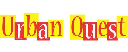
Not sure on what title was being used at the time of making it, I made doubles just in case (Urban Quest being the final choice). 

After much umming and ahhing about which one to use, I remembered that I could change the colour using the fill tool in Photoshop. Switching out some of the colours for the ones in the palette, only one came out looking worthy enough to be on the poster.

But then came the font for the slogan and website. I needed to find something decide that would stand out clearly from the background as well as sticking with the theme.
Looking through Dafont I found some that seemed to fit, and I decided to test them out just in case.


I created two different coloured ones just in case someone in the group preferred one to the other. In which case we could have both. Posting these up on Facebook to get some general feed back, I got that the in yellow poster, the roads look like veins or arteries because of the colour. Also I was told that the text in the same poster, was difficult to read.


So I changed it.

I later got some more feedback saying that the background colours were too vibrant or harsh, so to change that I added a complete white layer over the top of both of them and set the opacity to about 35% to lessen the harshness of the colours.


I then added the QR code to the corners and the website underneath (for people who don't use QR codes) to finish off the posters. Of course they were not fulling finished as I needed to get more feedback on the 'final' posters. My group replied with, the font showing the slogan and website were too difficult to read in the background. So in response I changed the font to a thicker style in hopes that it stands out more and clearer.


These two images above, are the finished, final posters.


Correction, the two images above were the final posters, till things got changed around.


Monday, 24 November 2014

Poster Creating

To start off my poster, I looked at a load of different styled poster through Google for a bit of inspiration. Looking through my artist studies again to see if it would trigger anything. I looked into map like posters, finding some really good posters that I wanted to do, however with the time limit I had I wasn't able to make them in time. I also had to factor in that I needed to make these posters simple and eye catching with out being tacky and cliche.
An image I found that interested me and also gave me the idea for the finished product.

I also tried looking for a simple, eye catching logo for it. I found a nice website, called Text Giraffe, which give you ready made logos to choose from and you can edit what it says.

These are the main themes of posters I looked at using key words from our project.

1. Winter
I tried looking into winter themes as it's near Christmas, however I the poster in which I started to make didn't look right for what we were trying to advertise. After seeing some simple posters with a winter theme I tried to make one.


I used some colour palettes to help with the general colour scheme.
After looking at colour schemes I search for a logo that could fit in colour wise and theme wise.

2. Film 
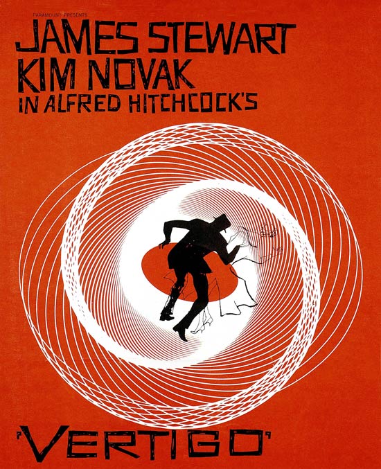
I tried to look into film posters as it relates to our course, and came with some interesting results. Some inspiration from Alfred Hitchcock and his famous yet simple posters. A lot of red and yellows, silhouettes and almost cryptic text to pull people in. 


3. Maps 

Seeing this image I liked, I wanted to use this style in the posters, yet came across a problem when Farnham doesn't have an underground train system or a complex looking railway line. So instead I kept looking round for these sorts of posters to see if I could find a way to recreate Farnham in this new fashion.
I then came across this artist, who I believe is called Jazzberry Blue (real or stage name i'm not sure), who's work was just what I needed to help with this project.

  
5. urban 
To add an urban spin to this work I looked up some urban posters which gave some very varied results. Sadly the posters that I wanted to create were not only too complex for the time I had but I also needed knowledge of Illustrator which I don't have, yet.


My Poster Attempts 1 and 2

Attempt 1

Starting off with some winter inspiration I looked for sample colour palettes to help narrow down what I could use on the poster and keep it so the colours didn't clash.


Now I had the colours I could look for a logo with the same palette to put on the poster, using the website Text Giraffe I found a few logos that could be used. 


Using them all in different layers on Photoshop I judged how each of them looked against the back ground of this poster. 

However, the background was proving more trouble then I hoped, seeing as I didn't have Illustrator, I had to improvise with my knowledge of Photoshop to create what I had in mind. About halfway through I got a bit stuck, not with how to make the design, but more with how the design looked. 


After showing it to another group member for an opinion we both discussed that it wasn't the right design we were looking for, so I scrapped that idea and tried another.


Attempt 2

Aiming for the theme to be based more around Farnham, I looked up photos of Farnham to see what I could use, as this attempt was going to try and silhouette a part of Farnham, again Illustrator style. 
The only problem being that a lot of the photos I found were landscape rather portrait which is what I was working.


I tried to work with a couple of them, however some didn't look right in the portrait format so I gave up on those. The ones that didn't look too bad I tried to silhouette to see what sort of effect it had.


Yet, with each image I couldn't silhouette much of it's content leaving very little to look at, also that made it difficult to make out what is in the image and where it's located.


Tuesday, 18 November 2014

Charlie's Poster Attempts 1 and 2

To promote our event our group decided to make a poster that we could put up around uni and in the general Farnham area. But, it was getting an idea of how we wanted the poster to look. We needed it to stand out and grabs peoples attention but not let it be tacky. Then there was the factor of making it so it didn't reveal too much information about the event as to entice who ever read it.