Sunday 30 November 2014

Final Poster

For the final poster I used the map and urban part of my research to inspire this final piece. I searched for a urban colour palette just to see what it gave me, and to my surprise I found a nice selection of colours that stand out but aren't an eye sore.


I then had to think about what I was actually gonna put on the poster, and looking back at the research I had done I decided to try something new with a map of Farnham.

Taking this screenshot of Farnham I rotated it 180 degrees so it fit into the portrait format. Then, with a lot of patience, I used the magic wand to highlight the main roads, cutting them from the image and filling them with a different colour. I also added a texture over the top to give the poster some texture rather then being plain bold colours.


With the colour palette in mind I went back to Text Giraffe to find some suitable logos for this new poster. Returning with many logos, I had to put them of to the base of the new poster and flick through each one of them to see which looked good and which ones I had to get rid of.


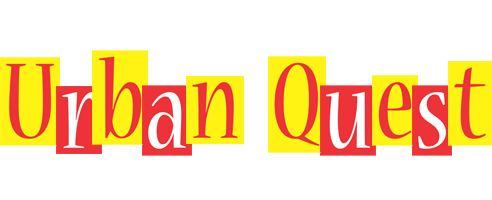
Not sure on what title was being used at the time of making it, I made doubles just in case (Urban Quest being the final choice). 

After much umming and ahhing about which one to use, I remembered that I could change the colour using the fill tool in Photoshop. Switching out some of the colours for the ones in the palette, only one came out looking worthy enough to be on the poster.

But then came the font for the slogan and website. I needed to find something decide that would stand out clearly from the background as well as sticking with the theme.
Looking through Dafont I found some that seemed to fit, and I decided to test them out just in case.


I created two different coloured ones just in case someone in the group preferred one to the other. In which case we could have both. Posting these up on Facebook to get some general feed back, I got that the in yellow poster, the roads look like veins or arteries because of the colour. Also I was told that the text in the same poster, was difficult to read.


So I changed it.

I later got some more feedback saying that the background colours were too vibrant or harsh, so to change that I added a complete white layer over the top of both of them and set the opacity to about 35% to lessen the harshness of the colours.


I then added the QR code to the corners and the website underneath (for people who don't use QR codes) to finish off the posters. Of course they were not fulling finished as I needed to get more feedback on the 'final' posters. My group replied with, the font showing the slogan and website were too difficult to read in the background. So in response I changed the font to a thicker style in hopes that it stands out more and clearer.


These two images above, are the finished, final posters.


Correction, the two images above were the final posters, till things got changed around.


Monday 24 November 2014

Poster Creating

To start off my poster, I looked at a load of different styled poster through Google for a bit of inspiration. Looking through my artist studies again to see if it would trigger anything. I looked into map like posters, finding some really good posters that I wanted to do, however with the time limit I had I wasn't able to make them in time. I also had to factor in that I needed to make these posters simple and eye catching with out being tacky and cliche.
An image I found that interested me and also gave me the idea for the finished product.

I also tried looking for a simple, eye catching logo for it. I found a nice website, called Text Giraffe, which give you ready made logos to choose from and you can edit what it says.

These are the main themes of posters I looked at using key words from our project.

1. Winter
I tried looking into winter themes as it's near Christmas, however I the poster in which I started to make didn't look right for what we were trying to advertise. After seeing some simple posters with a winter theme I tried to make one.


I used some colour palettes to help with the general colour scheme.
After looking at colour schemes I search for a logo that could fit in colour wise and theme wise.

2. Film 
I tried to look into film posters as it relates to our course, and came with some interesting results. Some inspiration from Alfred Hitchcock and his famous yet simple posters. A lot of red and yellows, silhouettes and almost cryptic text to pull people in. 


3. Maps 

Seeing this image I liked, I wanted to use this style in the posters, yet came across a problem when Farnham doesn't have an underground train system or a complex looking railway line. So instead I kept looking round for these sorts of posters to see if I could find a way to recreate Farnham in this new fashion.
I then came across this artist, who I believe is called Jazzberry Blue (real or stage name i'm not sure), who's work was just what I needed to help with this project.

  
5. urban 
To add an urban spin to this work I looked up some urban posters which gave some very varied results. Sadly the posters that I wanted to create were not only too complex for the time I had but I also needed knowledge of Illustrator which I don't have, yet.


My Poster Attempts 1 and 2

Attempt 1

Starting off with some winter inspiration I looked for sample colour palettes to help narrow down what I could use on the poster and keep it so the colours didn't clash.


Now I had the colours I could look for a logo with the same palette to put on the poster, using the website Text Giraffe I found a few logos that could be used. 


Using them all in different layers on Photoshop I judged how each of them looked against the back ground of this poster. 

However, the background was proving more trouble then I hoped, seeing as I didn't have Illustrator, I had to improvise with my knowledge of Photoshop to create what I had in mind. About halfway through I got a bit stuck, not with how to make the design, but more with how the design looked. 


After showing it to another group member for an opinion we both discussed that it wasn't the right design we were looking for, so I scrapped that idea and tried another.


Attempt 2

Aiming for the theme to be based more around Farnham, I looked up photos of Farnham to see what I could use, as this attempt was going to try and silhouette a part of Farnham, again Illustrator style. 
The only problem being that a lot of the photos I found were landscape rather portrait which is what I was working.


I tried to work with a couple of them, however some didn't look right in the portrait format so I gave up on those. The ones that didn't look too bad I tried to silhouette to see what sort of effect it had.


Yet, with each image I couldn't silhouette much of it's content leaving very little to look at, also that made it difficult to make out what is in the image and where it's located.


Sunday 23 November 2014

Researching Studio Shoot Roles

My roles in the studio shoot were too keep continuity in check and gather sample materials for the set. For the set designing part of the pre-production I was told I was the set designer, upon researching what a set designers job is, I got to designing the set as told.

Set design
A designer looks at the details searching for evidence through research to produce conceptual ideas that’s best toward supporting the content and values with visual elements. The subject of, “How do we generate creative ideas?” is a very legitimate question. The most consuming part of expanding our horizons toward scenic concepts is much more than witnessing creativity, and creative people. It starts with us opening our mind to the possibilities. To have an attitude toward learning, seeking, and engaging in creativity and to be willing to be adventurous, inquisitive and curious. Our imagination is highly visual. Whether outside or inside, colorful trees or concerts, star lit skies or the architecture of a great building, scenic design is a process of discovery. Discovering what will best clarify and support the story being told.

I made a list of the things I had to do and got to designing the prison set as close to the directors thoughts using Photoshop and then presented it to her. However she thought a set designer was just collecting sample pieces, like paint or wallpaper samples, for the set design. So I changed it and what she wanted instead and of was left with nothing else to do as that was the only job I was given.

My list:
  • basic ground plan showing all stationary elements;
  • ground plan showing all moving elements, indicating both onstage and storage positions;
  • section of the stage space incorporating all elements


My role during the studio shoot was continuity. Before research I thought continuity was someone who keeps the things that'll be in frame in order, such as props, costumes, and makeup. However after research I found out it was that and much more. 

Continuity

Also known as the continuity person, the Script Supervisor keeps track of what parts of the script have been filmed and makes notes of any deviations between what was actually filmed and what appeared in the script. They make notes on every shot, and keep track of props, blocking, and other details to ensure continuity from shot to shot and scene to scene. The Script Supervisor's notes are given to the Editor to expedite the editing process. The Script Supervisor works very closely with the Director on set.

The role of continuity is sometimes called Script supervisor as they also keep eyes on the shots, script, actor placement, takes, etc. 
  • Continuity – The supervisor is responsible for working with all departments to make sure that continuity errors do not happen. The script supervisor takes notes on all the details required to recreate the continuity of a particular scene, location, or actionFor every take, the script supervisor will note the duration of the take, meticulously log information about the action of the take, including position of the main actor, screen direction of their movement, important actions performed during the shot, type of lens used, and additional information. When multiple cameras are in use, the script supervisor keeps separate notes on each. These logs also notate a director's comments on any particular take as to whether it is no good, a hold take, or a print take. The shot notes provide the editor information on what the director prefers, any problems with any of the takes and other notes to assist the editing process.
  • Axis & Eye lines – The script supervisor is also the go-to person for determining the axis of a scene. The supervisor keeps track of and helps the director and the camera-operator set the camera position and off-camera eye lines ensuring that the coverage of a scene cuts seamlessly and that the characters within a scene always appear, without any confusion on the part of the viewer, to be looking precisely at the intended character or object.
  • Slating – The script supervisor interacts with the clapper loader and the production sound mixer to make sure that each take of exposed film has a consistent and meaningful slate, that the sound and picture slates match. The script supervisor also notes the sound roll of each sync take. This ensures that there is proper identification on the film footage in the editing room so the editor can find and use the correct takes.
  • Script – The script supervisor is responsible for keeping the most current version of the shooting script. During shooting, the script supervisor notates any changes from the screenplay that are made by the actors, director or others during the actual filming process. If significant changes are made to the script that affect a future day's shooting, the script supervisor is responsible for providing those changes to the assistant director's team who then will distribute those changes to the rest of the crew. The script supervisor's script is also referred to as their lined script because during shooting, a script supervisor draws a vertical line down the page for each different camera setup. Each line designates the start and stop of that setup, a quick note of what the shot description was and whether or not the dialogue was on camera for that setup. This allows the editor to quickly reference which camera setups cover which portion of the dialogue or action.
  • Production Reports – At the end of each shooting day, the script supervisor prepares daily reports for the production team. These reports vary in form depending on the studio or production company; however, they generally include a log of the actual times that shooting and breaks started and stopped, and a breakdown of the pages, scenes and minutes that were shot that day, as well as the same information for the previous day, the total script and the amounts remaining to be done. Also included are the number of scenes covered, the number of retakes, and the number of wild tracks. The script supervisor is the official timekeeper on any set.
  • Editor's Notes – In addition to the production reports, each shooting day the script supervisor also compiles the continuity logs for the day's shooting as well as the relevant lined script pages for the scenes shot that day. Those notes are sent off to the editorial staff to assist them in the editing process.


Thursday 20 November 2014

Preparation of domestic challenge

After much thought into how much work watching over multiple events and groups of people will be, whilst trying to juggle other Uni work, would be impossible, so we came up with only having 3 main tasks for 4 groups of 3 to complete. This way one person could take on the preproduction of one event, leaving another person to start preparing advertisement and the website.

My role was to come up with the preproduction material for our Domestics Challenge. I wrote out a Treatment and risk assessment for it.

However, as is seen the documents, they are not complete… that is due to a complete in our idea once again. (link to that post)

Tuesday 18 November 2014

Charlie's Poster Attempts 1 and 2

To promote our event our group decided to make a poster that we could put up around uni and in the general Farnham area. But, it was getting an idea of how we wanted the poster to look. We needed it to stand out and grabs peoples attention but not let it be tacky. Then there was the factor of making it so it didn't reveal too much information about the event as to entice who ever read it.

Wednesday 12 November 2014

Casting

On the 10th I went to Guildford to help Charlie with casting auditions. I stood/sit along side her to help make decisions and comment though-out the auditions and after. We recorded the audio of both auditions and then recorded footage of the actors acting the small part we gave them.

Ryan:
- He works well directors on set
- Prefers direction to freedom
- Okay at good at acting, for the drama in the scene he didn't play up to the part. Didn't really move around, lent forward at one point but that's it.

Ray:
- Half and half, likes the freedom and to be directed as well
- Very good at acting, really spoke out and emphasized when the part called for it. Moved around during his acting, even though he was in a chair and had limited movement.

Saturday 1 November 2014

Maps and Journeys New Development and Roles

Our idea of having 3 big events just didn't seem right or fun, and with deadlines coming up it didn't seem right to make groups do those events on specific dates when they could be busy. Instead we changed the 3 events back to an original idea of lots of little, simple events that can be done whenever they wanted.
We also planned it so that the end of the event wasn't the 12th December but the 17th February, so we can run the event over Christmas, leaving time for other people in course to join and the challenges, and the event then runs through our selected gallery time, so we can then put the event in the gallery (so to speak).

Obviously now our roles had gone and we had to think of new ones. Considering Charlie had started to put together the website or base of the event the rest of us took chunks to help with the process. Nick took the Social Network advertisement side of things like, posting the UCA page on Facebook and advertising through his other event, Games night. Kat took the video advertisement, such as making a trailer to spread across social networks, and test footage of challenges to show people that they aren't difficult to do.
And then there is my role, which is advertisement through posters or images, making them and getting them out there. I also took a quick role in making a logo for the website. Not sure where to start we tried doing a poster in a group but that didn't go so well (as seen in Charlie's first attempt)